Colour in the workplace is often treated as a finishing touch. In reality, it is a performance tool.
Walk into a neutral office and then into one where colour is intentionally applied. The difference is immediate. This is not preference – it is neuroscience. Colour shapes how the brain processes a space, which directly affects how people think, feel, and work within it.
As companies invest more into workplace design and question the return on that investment, office colour psychology remains one of the most underused levers. It is relatively inexpensive to implement well, and costly to correct when overlooked.
This is not about making an office look better. It is about making it work better.
Why Colour Impacts Performance
The brain does not experience colour passively. It responds to it before conscious thought kicks in.
That is why some spaces feel energising the moment you enter, while others feel flat or draining without an obvious reason.
Research consistently shows that different colours trigger different cognitive responses. For example:
- Blue environments support creative thinking and sustained focus
- Red improves attention to detail and task accuracy
- Warm tones increase alertness but can lead to fatigue over time
- Cool tones support longer periods of concentration
The takeaway is simple: there is no single “best” colour for an office. There is only the right colour strategy for each function.
Yet many workplaces still apply one palette across the entire floor. A focus area and a brainstorming space are designed the same way, despite requiring completely different mental states. This is where performance is quietly lost.
A Practical Guide to Office Colour Psychology
A more effective approach is to treat colour as a functional design language. Each colour family supports a different type of work.
Blue: Focus and Trust
Blue is one of the most reliable colours in knowledge-driven environments. It reduces stress, supports concentration, and enhances creative output. Deeper tones like navy also communicate stability and credibility, making them effective in client-facing areas.
Green: Recovery and Balance
Green requires minimal effort for the eye to process, making it ideal for restorative spaces. It helps reduce mental fatigue and supports reset between tasks. This makes it well suited for breakout areas, lounges, and pantry spaces.
Yellow: Energy and Stimulation
Yellow can energise and uplift—but only in controlled doses. Overuse leads to visual fatigue. It works best as an accent in collaboration zones or social areas, rather than as a dominant colour.
Red: Urgency and Precision
Red increases alertness and sharpens focus on detail. It is useful in high-intensity, short-duration work settings, but not suitable for prolonged use in focus-heavy environments.
Neutrals: Flexibility and Space
White and light neutrals create visual clarity and openness. However, when used without layering, they can feel generic or underinvested. Warmer neutrals tend to perform better in tropical contexts like Singapore.
Dark Tones: Focus and Sophistication
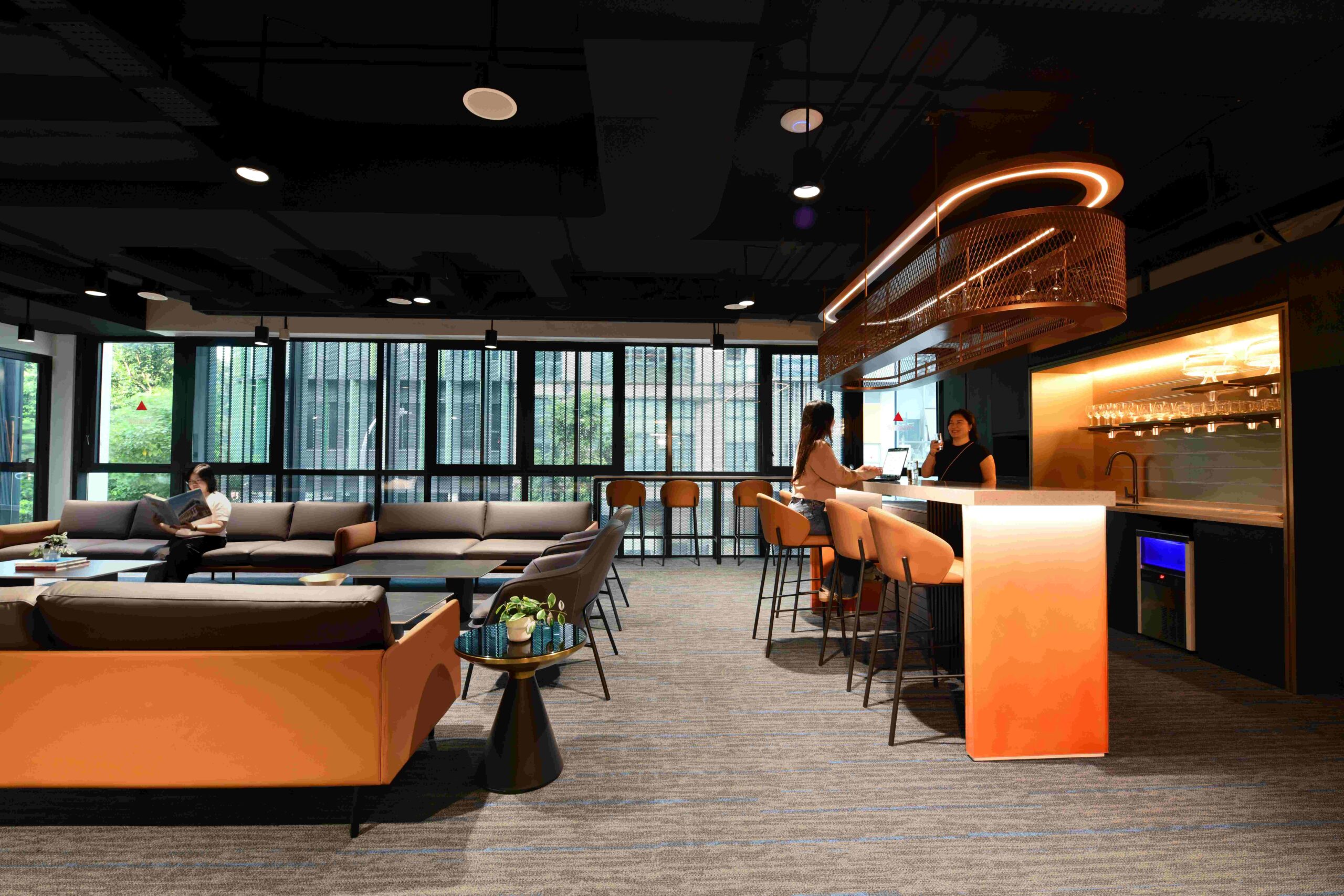
Deeper shades such as charcoal, forest green, and navy create a sense of enclosure that supports concentration. They also elevate perceived quality in client-facing spaces. These tones require careful lighting to avoid feeling heavy.
Designing with Zones, Not Just Colours
The most effective workplaces do not rely on a single palette. They use a zone-based colour strategy aligned to behaviour.
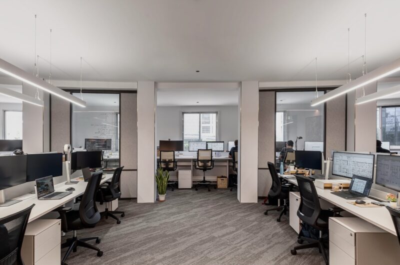
- Focus zones: cool tones or soft neutrals to support deep work
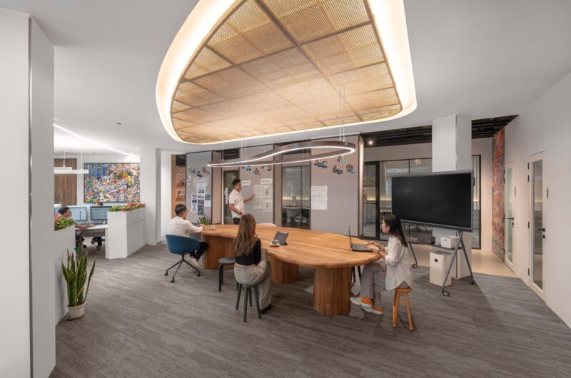
- Collaboration zones: warmer, more saturated colours to encourage interaction
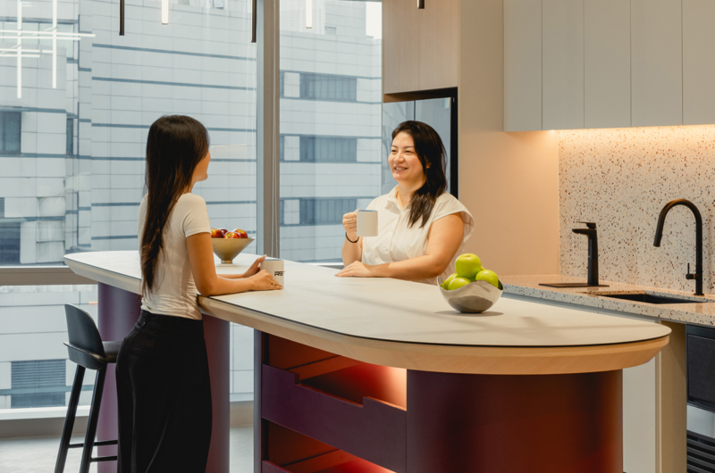
- Social spaces: restorative tones like greens and earth colours
- Client areas: a balance of brand expression and psychological comfort
Equally important are transitions. Moving from one zone to another should feel intentional, not abrupt. Subtle shifts in tone, material, or lighting help create a cohesive experience across the office.
Colour and Brand: Beyond the Logo
Branding in workplace design is often misunderstood.
Applying brand colours everywhere rarely creates a meaningful environment. Instead, colour should express how the brand feels.
For example, a company positioned around innovation does not need walls in its brand colour. It needs a space that feels dynamic, energetic, and forward-moving. Colour becomes part of that experience, not just a visual identifier.
This approach is more timeless and avoids the need for frequent redesign.
The Variables That Change Everything
Colour does not exist in isolation. Its impact depends on how it interacts with other elements.
Light
Natural light shifts throughout the day, especially in Singapore’s climate. Colours will appear different in morning versus afternoon conditions. This needs to be considered during selection.
Finish
Matte, satin, and gloss finishes alter how colour is perceived. Matte creates depth and consistency, while gloss reflects light and intensifies colour.
Ceiling Treatment
Ceiling colour significantly affects spatial perception. A lighter ceiling can make a space feel taller, while a darker or matched ceiling creates intimacy and focus.
Ignoring these variables often leads to results that differ from what was intended at the design stage.
What This Means for Your Workplace
Applying office colour psychology effectively starts with a few key questions:
- What kind of work happens in each zone?
- What mental state should each space support?
- How does the brand translate into a physical environment?
- How will light and material affect colour throughout the day?
These decisions do not require a larger budget—only greater intention.
When colour is treated as a performance variable rather than decoration, the result is a workplace that not only looks considered, but works measurably better for the people using it.